CSS Flexible Box Layout Module Level 1
dev.w3.org/csswg/css-flexbox/Candidate Recommendation: Jan-05-2016
CSS Flexible Box Layout Module Level 1
dev.w3.org/csswg/css-flexbox/Candidate Recommendation: Jan-05-2016
flex and inline-flex. Used on parent to create the flex container.stretch | space-evenlystretchauto | flex-start | flex-end | center | baseline | stretch[flex-basis flex-grow, and flex-shrink, or nonerow, row-reverse, column or columns-reverse on the parentflex-direction and flex-wrap properties.nowrap, wrap or wrap-reverseflex-start | flex-end | center | space-between | space-around | space-evenlyauto, not 0auto, not 0display: flex; to the parent of the elements to be flexed.flex-direction to horizontal or verticalflex-wrap to control wrap directiondisplay property
inline | block | list-item | inline-list-item | inline-block | flex | inline-flex | grid | inline-grid | table | inline-table | table-row-group | table-header-group | table-footer-group | table-row | table-cell | table-column-group | table-column | table-caption | ruby | ruby-base | ruby-text | ruby-base-container | ruby-text-container | contents | none | flow | flow-root
display property
inline | block | list-item | inline-block | flex | inline-flex | grid | inline-grid | table | inline-table | ruby | none
display: flex;
block-level flex container box
display: inline-flex;
inline-level flex container box
display propertyFlex items
Not flex items
Kind of
Changed Properties
margin: adjacent flex items margins do not collapsemin-width & min-height: default is auto, not 0visibility: collapse;Ignored Properties
flex-direction propertyrowrow-reversecolumn column-reverseflex-direction: ... flex-wrap propertynowrapwrapwrap-reversePurpose: is the whole shebang on one line, or can it wrap if necessary?
flex-wrap: ...flex-flow propertyShorthand for flex-direction and flex-wrap
flex-flow: ...justify-content propertyflex-startflex-endcenterspace-betweenspace-aroundspace-evenlyaligns flex items along the main axis
justify-content propertyalign-items propertyflex-startflex-endcenterbaselinestretchaligns flex items along the cross axis
align-items propertyvisibility: collapsealign-content propertyflex-startflex-endcenterspace-betweenspace-aroundstretchspace-evenlyOnly applies to multi-line flex containers.
align-content propertyalign-self propertyautoflex-startflex-endcenterbaselinestretchOverride the align-items on a per flex item basis
align-self propertyalign-self propertyorder propertydiv:nth-of-type(3n) {
order: -1;
}
The default value is 0. Anything lower will come before those without set values. Anything above will come after.
order: ...flex shorthandflex-grow:
How to divide the extra space. Non-negative number. default: 1.
flex-shrink:
How to shrink if there's not enough room. Non-negative number. default: 1.
flex-basis:
the
starting size
before free
space is
distributed. length value, content or auto . If set to auto, sets to flex item’s main size property.
flex shorthand propertyflex relative numbersflex-basis 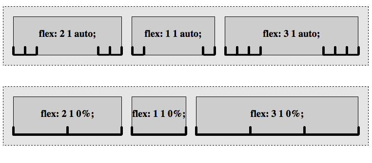
flex-basis