and to change slides. 2 for comments. estelle.github.com/CSS

Backgrounds

https://estelle.github.io/CSS/background

Due to CanIUse quirks, please click on headers that read "Browser support:" to load caniuse

Backgrounds

  • Background properties
    • background-color
    • background-image
    • background-repeat
    • background-attachment
    • background-position
    • background-clip
    • background-origin
    • background-size
    • background shorthand
  • background-blend-mode
  • CSS Filters
    • filter
    • backdrop-filter
    • <filter> functions
      • blur()
      • brightness()
      • contrast()
      • grayscale()
      • drop-shadow
      • hue-rotate
      • invert()
      • sepia()
      • saturate()

Background properties

background-color property

background-color property

Sets the background color of an element.

rgb() | rgba() | hsl()> | hsla() | <hex-color> | <named-color> | currentcolor

Unlike the other background longhand properties, this one takes only a single value.

The uniform color of the background is rendered behind any specified background-images and may be visible through any transparency in the images.
background-color

  • Use any of the color types
  • Always declare when declaring background images
  • Declare only once in a shorthand declaration.
  • Nothing really new here
  background-color: white;
  background-color: #fff;
  background-color: #FFFFFF;
  background-color: #FFFFFFFF;
  background-color: rgb(255,255,255);
  background-color: rgb(100%,100%,100%);
  background-color: rgba(255,255,255,1);
  background-color: rgba(100%,100%,100%, 1);
  background-color: hsl(0, 100%, 100%);
  background-color: hsla(0, 100%, 100%, 1);
  background-color: transparent;
  background-color: currentColor;

Confused? See Colors & Transparency

background-image property

Old School: background-image

background-image: none | <uri> | inherit 
background-image: url(path/aSingleImage.jpg);

Often part of background shorthand with:

  • background-repeat
  • background-attachment
  • background-position
  • background-color
  • background-clip
  • background-origin
  • background-size

Don't use background shorthand for risk of resetting any of 7 other (8 total) properties to default values

background-image property

Sets one or more background images on an element.

none | inherit | <url> | <image()> | <image-set()> | <element()> 
<cross-fade()> | <gradient> | <paint()>

Either none, inherit, or one or more comma-separated <image> values.

background-image: url( "path/to/images/photo.jpg" );

multiple background images

Sets one or more background images on an element.

none | inherit | [<image>]# 
<image> = <url> | <image()> | <image-set()> | <element()> 
          <cross-fade()> | <gradient> | <paint()>
background-image: url(green.gif), url(blue.gif);
  • Comma separated
  • layered front to back
  • Include background-color

paint() is new in houdini

background image tips

  • Make sure there's enough contrast with text
    • add drop shadow
  • Include a background color to ensure contrast if image fails.
  • Doesn't print by default
  • Not accessible

background-image value types

none | <url>  | <gradient> | 
<image()> | <element()> | <image-set()> | <cross-fade()> | <paint()>
none
url(firstImage.jpg), url(secondImage.jpg)
url(data:image/gif;base64,fOulrS123hEAAa517sdfQfda...)
url("data:image/svg+xml;utf8,<svg xmlns='http://www.w3.org/2000/svg' width='220' height='200'><circle cx='55' cy='190' r='25' fill='#FFF' /></svg>");
linear-gradient(to bottom, green, blue)
radial-gradient(circle, green, blue)
paint(workletName)

background-image

background-image: url(myGif.gif), url(otherGif.gif);
background-image: none;
background-image: linear-gradient(top, red, blue);
background-image: url(data:image/gif;base64,fOulrShEAAQ...);
background-image:
  url("data:image/svg+xml;utf8,<svg xmlns='http://www.w3.org/2000/svg' width='220' height='200'><circle cx='55' cy='190' r='25' fill='#FFF' /></svg>");

Maybe, one day ...

background-image: element('#myID');
background-image: image('ico_sprite.jpg#xywh=32,64,16,16');
background-image: image("try1.svg", 'try2.png' , "try3.gif");

background-repeat property

background-repeat

sets how background images are repeated. A background image can be repeated along the horizontal and vertical axes, or not repeated at all.

repeat | repeat-x | repeat-y | no-repeat | space | round;

Can be comma-seperated for each background image or same value for all

repeat
Tiled as often as needed to cover background
no-repeat
Placed once, not tiled or repeated
repeat-x
Tiled along X axis only (Equivalent to repeat no-repeat)
repeat-y
Tiled along Y axis only (Equivalent to no-repeat repeat)
space
Repeated as often as will fit without being clipped, spaced out evenly
round
Repeated as often as will fit without being clipped then scaled so no space in between

background-repeat

background-repeat: no-repeat; 

Should accept 2 values (H & V)
Tip: Include background-repeat: no-repeat; in your reset CSS

Understand background-repeat

Test out repeat | round | space

background-attachment property

background-attachment

Sets whether a background image's position is fixed within the viewport, or scrolls with its containing block.

background-attachment: fixed | local | scroll

Can be comma-seperated for each background image or same value for all

fixed
Background fixed relative to the viewport. Even if an element has a scrolling mechanism, the background doesn't move with the element. Not compatible with background-clip: text.)
local
Background fixed relative to the element's contents as if attached to whatever word it was behind. If the element has a scrolling mechanism, the background scrolls with the element's contents.
scroll
Background is fixed relative to the element itself and does not scroll with its contents as if attached to the border.

background-attachment

isolated use case

You may write me down in history With your bitter, twisted lies, You may trod me in the very dirt But still, like dust, I'll rise. Does my sassiness upset you? Why are you beset with gloom? ’Cause I walk like I've got oil wells Pumping in my living room. Just like moons and like suns, With the certainty of tides, Just like hopes springing high, Still I'll rise. Did you want to see me broken? Bowed head and lowered eyes? Shoulders falling down like teardrops, Weakened by my soulful cries? Does my haughtiness offend you? Don't you take it awful hard ’Cause I laugh like I've got gold mines Diggin’ in my own backyard. You may shoot me with your words, You may cut me with your eyes, You may kill me with your hatefulness, But still, like air, I’ll rise. Does my sexiness upset you? Does it come as a surprise That I dance like I've got diamonds At the meeting of my thighs? Out of the huts of history’s shame I rise Up from a past that’s rooted in pain I rise I'm a black ocean, leaping and wide, Welling and swelling I bear in the tide. Leaving behind nights of terror and fear I rise Into a daybreak that’s wondrously clear I rise Bringing the gifts that my ancestors gave, I am the dream and the hope of the slave. I rise I rise I rise..

background-position property

background-position property

Sets the initial position for each background image (relative to background-origin

left | center | right | top | bottom | <length-percentage>

Can be comma-seperated for each background image or same value for all

If one length/% value: it's the left offset, centered vertically

background-position: <left-value> <top-value>

Four values is two keyterms with an offset for each

background-position: <left-right> <LR-offset> <top-value> <TB-offset>

Order matters if you're using length-percentage. Won't fail for keywords, unless you use two vertical or two horizontal

Understanding % based background-position


4-value background-position

Positioning relative to any corner

background-clip & background-origin property

background-clip

Sets whether an element's background extends underneath its border box, padding box, or content box.

border-box | padding-box | content-box | text 
border-box
The background extends to the outside edge of the border (but underneath the border in z-ordering).
padding-box
The background extends to the outside edge of the padding. No background is drawn beneath the border.
content-box
The background is painted within (clipped to) the content box.
text
The background is painted within (clipped to) the foreground text.

background-clip

background-clip: border-box | padding-box | content-box | text 
content-box
padding-box
border-box
text text text

background-origin

Sets the background's origin: from the border start, inside the border, or inside the padding.

border-box | padding-box | content-box
border-box
The background is positioned relative to the border box.
padding-box
The background is positioned relative to the padding box.
content-box
The background is positioned relative to the content box.

background-origin

background-origin: border-box | padding-box | content-box

Can be comma-seperated for each background image or same value for all

content-box
padding-box
border-box

background-clip / background-origin


background-size

background-size property

Sets the size of the element's background image. The image can be left to its natural size, stretched, or constrained to fit the available space.

cover | contain | [ <length-percentage> | auto ]{1,2}

Can be comma-seperated for each background image or same value for all

contain
Scales up or down until 100% height or width, without going over, and without cropping or stretching.
cover
Scales the image as needed to cover 100%. Cropped if needed.
auto
Same size as original or 100% of no intrinsic value set.
<length>
Sized as defined No negative values.
<percentage>
Relative to the size of the element area as determined by the background-origin (padding box by default). If background-attachment: fixed is set, the viewport size. No negative values.

background-size

background-size: auto | contain | cover | <length>
  • Needed for hiDPI images
  • ‘contain’ grows/shrinks to fully fit - may have 'white space', but no clipping.
  • ‘cover’ grows to min size that covers 100% of height & width - no white space, but might clip.
  • Note: Use for creating gradients backgrounds
    • note 2 length values needed to constrain a gradient

background-size

background-size: auto | contain | cover | 100px 200px | 150px
auto
image is actual size
cover
image maintains aspect ratio, covering entire element even if that means part of the image is cut off.
contain
image maintains aspect ratio, fitting the entire image into the element even if that means part of the background is showing or the image repeats.
length
image maintains aspect ratio, growing or shrinking so that the width is the length defined
auto length
image maintains aspect ratio, growing or shrinking so that the height is the length defined
length length
image DOES NOT NECESSARILY maintain its aspect ratio, height and width both grow or shrink to the length defined

Understand background-size

Test out cover | contain | auto | <length-percent>{1,2}

background shorthand property

background shorthand

background:
 img1 position / size repeat attachment origin clip,
 img2 position / size repeat attachment origin clip,
 img3 position / size repeat attachment box{1,2} bgcolor;    
background:
 url(topImg.jpg) 0 0 / 30px 30px repeat scroll border-box content-box,
 url(botImg.jpg) 15px 15px / 30px 30px fixed border-box #609;

DO NOT USE BACKGROUND SHORTHAND!!!

  • Border properties & browser support
  • If one ‘box’ value is present then it sets both 'background-origin' and 'background-clip' to that value. If two values are present, then the first sets 'background-origin' and the second 'background-clip'

Play with background shorthand

Test out 'img/shark.gif' | 'img/aria.jpg'

Play with background shorthand

Remove the color? Change all the properties?

Play with longhand properties

Is using longhand values less confusing? I got you started....

background-blend-mode property

Sets how an element's background images should blend with each other and with the element's background color.

normal | multiply | screen | overlay | darken | lighten | color-dodge 
color-burn | hard-light | soft-light | difference | exclusion
hue | saturation | color | luminosity

Blending modes should be defined in the same order as the background-image property. If the blending modes' and background images' list lengths are not equal, it will be repeated and/or truncated until lengths match.

background-blend-mode: screen, multiply;

background-blend-mode

  • color
  • color-burn
  • color-dodge
  • darken
  • difference
  • exclusion
  • hard-light
  • hue
  • lighten
  • luminosity
  • multiply
  • normal
  • overlay
  • saturation
  • screen
  • soft-light
  • darken, multiply
  • difference, overlay
  • luminosity, saturation
  • hue, screen
  • exclusion, soft-light

Filter functions

Filters

Visit Site

filter property

Applies graphical effects like blur or color shift to an element.

none | blur() | brightness() | contrast() 
grayscale() | drop-shadow() | hue-rotate() | invert()
saturate() | opacity() | sepia() | url()

Applies the effects to a foreground element.

backdrop-filter property

Apply graphical effects to the area behind an element.

none | blur() | brightness() | contrast() 
grayscale() | drop-shadow() | hue-rotate() | invert()
saturate() | opacity() | sepia() | url()

Applicable to a background (v. filter which is foreground)

backdrop-filter: url(image.svg#focus) blur(6px) saturate(50%);

To see the effect you must make the element or its background at least partially transparent because it applies to everything behind the element.

Prefixed in safari. New to Chrome and Edge. Not in FF

<filter> functions

The <filter-function> data type is specified using one of the filter functions listed below. Each function requires an argument which, if invalid, results in no filter being applied.

blur()
Blurs the image. <length>
brightness()
Makes the image brighter or darker. <number-percent>
contrast()
Increases or decreases the image's contrast. <number-percent>
drop-shadow()
Applies a drop shadow behind the image. <x-y-blur-spread-color>
grayscale()
Converts the image to grayscale. <number-percent>
hue-rotate()​​​​​​​​​​​​​​
Changes the overall hue of the image. <angle>
invert()
Inverts the colors of the image. <number-percent>
opacity()
Makes the image transparent. <number-percent>
saturate()
Super-saturates or desaturates the input image. <number-percent>
sepia()
Converts the image to sepia. <number-percent>

Filter Activation!

Change the background of the deck so we can see filter-backdrop in action

remember how an invalid pseudoclass ruins everything?

In the next slides, change .body to body

blur() function

Applies a Gaussian blur set in <length>.

Negative values are not valid.

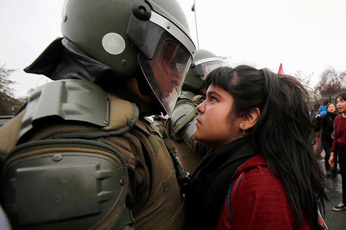
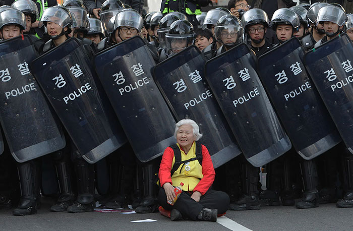
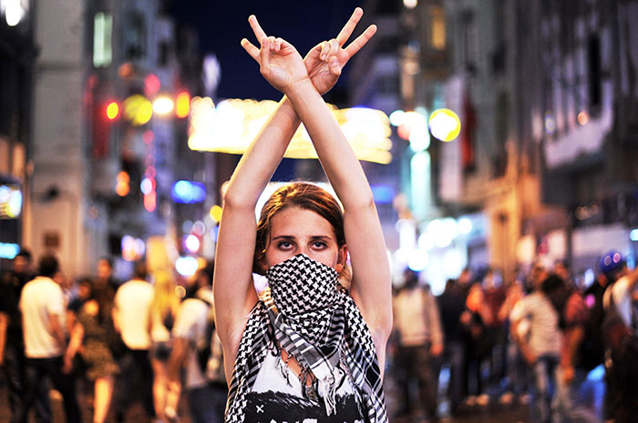
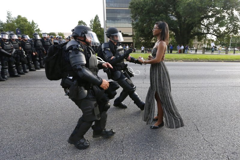
woman protesting

brightness() function

Applies a linear multiplier, making it appear brighter or darker. Set as a <percentage> or <number>. 0% and 0 are black. 200% and 2 doubles the brightness. 100% and 1 have no effect.

Negative values are not valid.

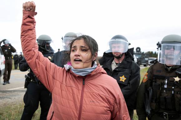
woman protesting

contrast() function

Adjusts the contrast of the input image. Set as a <percentage> or <number>. A value under 100% decreases the contrast, while a value over 100% increases it. 0% and 0 will be completely grey. 100% and 1 have no effect.

Negative values are not valid.

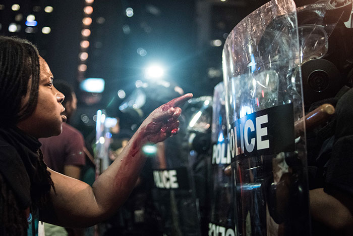
woman protesting

grayscale function

converts the input image to grayscale. Set as a <percentage> or <number>. 100% and 1 (and higher) are completely greyscale. 0% and 0 have no effect.

Negative values are not valid.

woman protesting

drop-shadow() function

applies a drop shadow effect to the input image. Syntax is the same as box-shadow, written as drop-shadow(offset-x offset-y blur-radius spread-radius color), but spread radius is not supported.

It follows the image :D.

A star

hue-rotate() function

rotates the hue of an element and its contents. Set as as <angle>. A positive angle increases the hue value. A negative rotation decreases the hue value. The values reset at 360deg, as if angle = <angle> % 360.

hue-rotate(-180deg) and hue-rotate(180deg) end up being the same, completely rotated. Even the border!

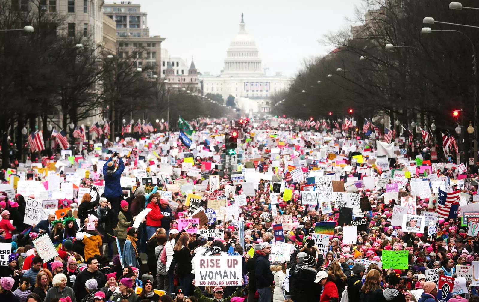
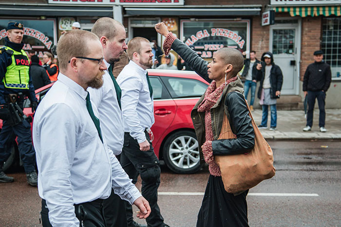
women protesting

invert() function

inverts the color samples in the input image. Set as a <percentage> or <number>. 100% or 1 is completely inverted. 0% leaves or 0 makes no change. Values between 0% and 100% and 0 and 1 are linear multipliers on the effect.

Negative values are not valid. Check out the difference betweetn inverting the slide v. the body.

woman protesting

sepia() function

converts the input image to sepia, giving it a more yellow/brown antique appearance. Set as a <percentage> or <number>. 0% and 0 are completely sepia. 200% and 2 doubles the sepia. 0% and 0 don't change the image's appearance.

Negative values are not valid. Change the effect from the slide to the body.

woman protesting

saturate() function

Super-saturates or desaturates the input image. Set as a <percentage> or <number>. 0% and 0 are completely unsatured: black and white. 200% and 2 doubles the saturation. 100% and 1 have no effect. Greater numbers create modern art.

Negative values are not valid.

woman protesting

Filter DeActivation!

Revert the unset

Gradients

Next ➹