- Intro to Floats
floatproperty- Exercise/Solution
- Intro to flex
- Flexible Box Properties
displayproperty- Impacted CSS Properties
flex-directionproperty- understanding axes
flex-wrappropertyflex-flowproperty- The Flex Container
place|align|justify-itemsproperties- Impact of
visibility collapse place|align|justify-contentproperties- Flex Items
place|align|justify-selfpropertiesalign-selfpropertyorderproperty- Accessibility
- Flexibility
flexshorthand- Examples
- DevTools
- Exercise/Solution
- Solution
Floats & Flexbox
Floats & Flexbox
Why?
Problem we're trying to solve
Floats
float property
float property values
float: left;
float: right;
float: none;
float: inline-start;
float: inline-end;
Understanding floats
float features
float features
- floated to the left or right
- Still in the flow (v. position: absolute)
- Text wraps around the float.
- Adjacent sibling moves up.
- If all children are floated, parent has no height!
- floated elements are at least as tall as their floated children
Understanding floats
clear property
Sets whether an element must be moved below (cleared) floating elements that precede it.
clear property values
none | both | left | right | inline-start | inline-end
Exercise
Open the I have a Dream
Improve the legibility. Consider:
- line height
- font face
- justification
- spacing
Exercise
Instructions
Open the I have a Dream, editing the HTML and the CSS to do the following:
- Add a caption to the image
- Encase the image, along with the caption, in a box with a border.
- There should be white space between all the elements and the border.
- Make the text wrap around the image.
- Ensure there is white space between the image and the text but not on the outside of the image.
Solution
Text - solution
:root {
  font-family: georgia,new times roman, serif;
  font-size: 18px;
  line-height: 1.6;
}
Images Solution
body {
  max-width: 50em;
  margin: auto;
}
blockquote {
  border: 1px solid #ccc;
  border-width: 1px 0;
}
figure {
  float: left;
  width: 40%;
  min-width: 300px;
  padding: 2px 1em 1em 2px;
  margin: 0 1em 1em 0;
  border-right: 1px solid #ccc;
}
img {
  width: 100%
}
figcaption {
  font-style: italic;
}
Flexbox
"What" and "Why"
Problem we're trying to solve
Flex Box
Flex Box
Flex Box
Flex Box
Fixed Header and Footer
Inline Flex
Browser support
With just a few lines ....
Holy Grail Layout
Components of Flexbox
- Creation: display
- Direction: flex-flow (flex-direction, flex-wrap)
- Alignment: justify-content, align-items, align-self, align-content, place-items, place-content
- Ordering: order
- Flexibility: flex (flex-grow, flex-shrink, flex-basis)
- Other: margin, gap
Flexible Box Properties
- display
- Values include
flexandinline-flex. Used on parent to create the flex container. - align-content
flex-start | flex-end | center | space-between | space-around | stretch | space-evenly- align-items
flex-start | flex-end | center | baseline | stretch- align-self
auto | flex-start | flex-end | center | baseline | stretch- flex
- Shorthand for
[flex-basis flex-grow, and flex-shrink, ornone
Flexible Box Properties
- flex-basis
- The basis by which the flex-items flex. default:
auto - flex-direction
- Set the containers axis for its children with
row,row-reverse,columnorcolumns-reverseon the parent - flex-flow
- Shorthand for
flex-directionandflex-wrapproperties. - flex-grow
- Positive number determines how much flex item will grow relative to other flex items in flex container when positive free space is distributed. Positive only
- flex-shrink
- Positive number determines how much flex item will shrink relative to other flex items in flex container when negative free space is distributed.
Flexible Box Properties
- flex-wrap
- To determine whether the boxes are single line or wrap, and the direction, use
nowrap,wraporwrap-reverse - justify-content
flex-start| flex-end | center | space-between | space-around | space-evenly- min-height
- Default is
auto, not0 - min-width
- Default is
auto, not0 - order
- Integer. Controls order of flex item within flex container
- gap
column-gapandrow-gap. minimum space between adjacent flex items and lines.
Flexible Box Properties
- place-items
- Shorthand for
align-itemsandjustify-items - place-content
- Shorthand for
align-contentandjustify-content - place-item
- Shorthand for
align-itemandjustify-item
The Basics
Steps
- Add
display: flex;to the parent of the elements to be flexed. - Set
flex-directionto horizontal or vertical - Set
flex-wrapto control wrap direction
The display property
All the display properties
display: block | inline | run-in | flow | flow-root | table | flex | grid | ruby | block flow | inline table | flex run-in | list-item | list-item block | list-item inline | list-item flow | list-item flow-root | list-item block flow | list-item block flow-root | flow list-item block | table-row-group | table-header-group | table-footer-group | table-row | table-cell | table-column-group | table-column | table-caption | ruby-base | ruby-text | ruby-base-container | ruby-text-container | contents | none | inline-block | inline-table | inline-flex | inline-grid | inherit | initial | unset | revert;
display property
inline | block | list-item | inline-block | flex | inline-flex | grid | inline-grid | table | inline-table | ruby | none
display: flex;
block-level flex container box
display: inline-flex;
inline-level flex container box
display property
display: inline-flex;
Flex impacts
What is a flex item
Flex items
- All non-absolutely positioned child nodes
- Generated Content
- anonymous flex items => non-empty text nodes
Not flex items
- ::first-line & ::first-letter
- white space
Kind of
- absolutely/fixed positioned elements
Impacted CSS Properties
Changed Properties
margin: adjacent flex items margins do not collapsemin-width&min-height: default is auto, not 0visibility: collapse;
Ignored Properties
- column-* properties
- float
- clear
- vertical-align
flex-direction property
flex-direction property
rowrow-reversecolumncolumn-reverse
flex-direction: ... (show gap)
flex-direction: ...
row & column
understanding axes
main-axis
main-axis
flex-wrap property
flex-wrap property
nowrapwrapwrap-reverse
Purpose: is the whole shebang on one line, or can it wrap if necessary?
flex-wrap: ...
Flex Box
flex-flow shorthand
flex-flow property
Shorthand for flex-direction and flex-wrap
flex-flow: ...
flex-flow
"But wait, there's more!"
--Ed Valenti
The Flex Container
Controlling Flex Items
from the flex container
place-items property
place-items is shorthand for align-items and justify-items
Think of it as aligning within each flex line.
align-items property
Aligns flex items along the cross axis
normal | center | start | end | self-start | self-end | flex-start | flex-end
Baseline alignment
align-items: baseline | first baseline | last baseline
Overflow alignment
safe center | unsafe center
does not take left and right values
align-items property
justify-items property
Defines the default justify-self for all the flex items, justifying items along axis.
Keyterms
auto |  normal |  stretch |  center |  start |  end |  flex-start
flex-end |  self-start |  self-end |  left |  right
Baseline alignment
baseline | first baseline | last baseline
Overflow alignment
justify-items: safe center | unsafe center
Legacy alignment
legacy right | legacy left | legacy center
justify item value ignored in flex if justify-items: normal;
place-items property
Shorthand for align-items and justify-items
place-items: [align-items] [justify-items]?;- If only one value, the
align-itemsvalue will be used for both
flex-startflex-endcenterbaselinestretch
aligns flex items along the cross axis
Impact of visibility: collapse
align-content property
flex-startflex-endcenterspace-betweenspace-aroundstretchspace-evenly
Only applies to multi-line flex containers.
Think of it as aligning between multiple lines
align-content property
justify-content property
justify-content: center;     /* Pack items around the center */
justify-content: start;      /* Pack items from the start */
justify-content: end;        /* Pack items from the end */
justify-content: flex-start; /* Pack flex items from the start */
justify-content: flex-end;   /* Pack flex items from the end */
justify-content: left;       /* Pack items from the left */
justify-content: right;      /* Pack items from the right */
justify-content: normal;
justify-content: space-between; /* Evenly, w/ first item at start, last at end */
justify-content: space-around;  /* Evenly. Half the space on ends */
justify-content: space-evenly;  /* Evenly, with equal space on ends */
justify-content: stretch;       /* Evenly. Stretch 'auto'-sized fit container */
justify-content property
Flex Items
Controlling Flex Items
align-self property
autoflex-startflex-endcenterbaselinestretch
Override the align-items on a per flex item basis
align-self property
align-self property
order property
div:nth-of-type(3n) {
   order: -1;
}
The default value is 0. Anything lower will come before those without set values. Anything above will come after.
order: ...
Source Order
<nav> comes after <main>
Accessibility
- Source Order
- Tab order
- Right to Left languages
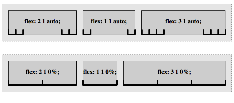
Flexibility
flex shorthand property
flex-grow:
How to divide the extra space. Non-negative number. default: 1.
flex-shrink:
How to shrink if there's not enough room. Non-negative number. default: 1.
flex-basis:
the
starting size
before free
space is
distributed. length value, content or auto . If set to auto, sets to flex item’s main size property.
flex shorthand
flex relative numbers
flex-basis property
flex and flex-basis properties
Examples
DevTools
Exercise
♥
♣
♦
Let's edit our card example just a bit.
- Center the heart, spade, diamond, or club that is the text node in your card.
/* card faces */
.face {
  font-size: 2em;
  display: flex;
  justify-content: center;
  align-items: center;
}