box-sizingproperty- Borders, Margin & Padding
- padding
- margin
- Margins how they work
- Block Formatting Context
- Border Properties
- DevTools
line-heightpropertyz-index- Stacking context
border-radius- Outlines and Shadows
outlinepropertiesoutlinepropertyoutline-offsetproperty- box shadows
box-shadowproperty- Overflow
overflowproperty- Size constraints
widthpropertyheightproperty- max-width & max-height
- min-width & min-height
displayproperty-
visibilityproperty - Exercise
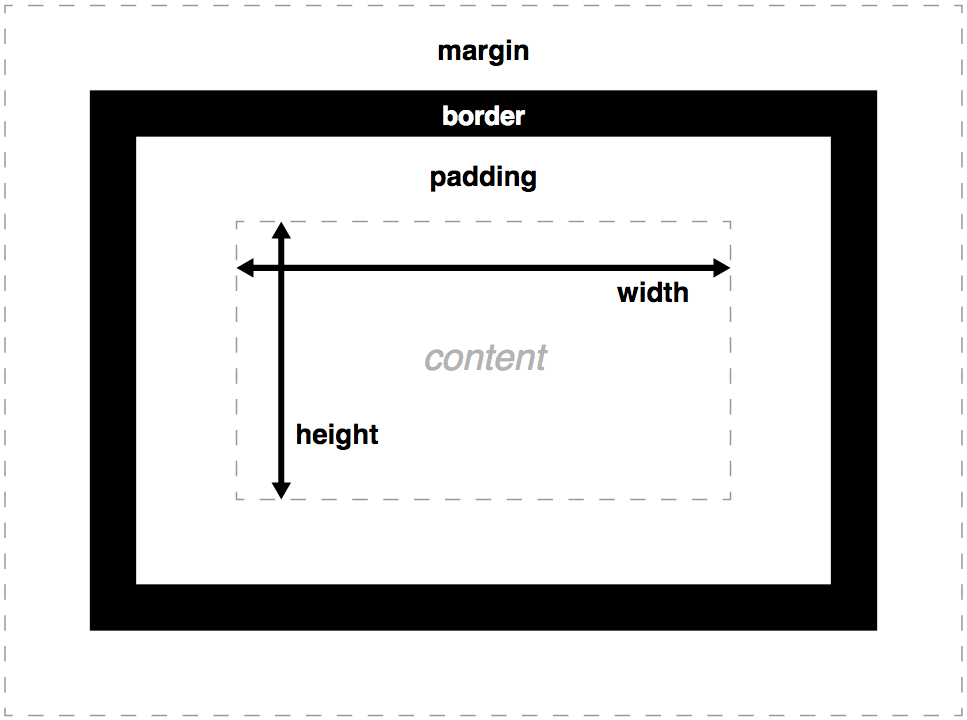
Box Model
Box Model Properties
Box Model Properties
margin
border
padding
content
Box Model Properties
height
- height*
- padding
- padding-top
- padding-bottom
- border
- border-top
- border-bottom
- margin
- margin-top*
- margin-bottom*
width
- width*
- padding
- padding-right
- padding-left
- border
- border-right
- border-left
- margin
- margin-right
- margin-left
Box Model Properties
Box Model Properties
box-sizing property
box-sizing property
Sets how the total width and height of an element is calculated
content-box | border-box| padding-box
- content-box
- Default (exceptin in old IE). The
widthandheightproperties include the content, but do not include thepadding, border, ormargin..box {width: 350px; border: 10px solid black;}is 370px wide.width= width of the content.height= height of the content.
(Borders and padding are not included in the calculation.) - border-box
- The
widthandheightproperties include the content,padding, andborder, but do not include themargin. Padding and border will be inside of the box..box {width: 350px; border: 10px solid black;}renders a box that is 350px wide, with the area for content being 330px wide. The content box is floored at 0. Dimensions of element are:width= border + padding + width of the content.height= border + padding + height of the content.
box-sizing: content-box
width
content = declared width - (padding-right + padding-left +
         border-right + border-left)
height
content = declared height - (padding-top + padding-bottom +
          border-top + border-bottom)
box-sizing: border-box;
width
physical width  = declared width +
         padding-right + padding-left +
         border-right  + border-left
height
physical height = declared height +
         padding-top + padding-bottom +
         border-top  + border-bottom
box-sizing: border-box;
padding properties
Shorthand for padding-top, padding-right, padding-bottom, and padding-left, it sets the padding area on all four sides of an element. Padding is spacing between border and content.
[ <length> | <percentage> ]{1,4}
Specified one, two, three, or four <length> or <percentage>values. Negative values are not valid.
| # of values | Assignment of each value |
|---|---|
| 1 | Applies the same padding to all four sides. |
| 2 | The first padding applies to the top and bottom, the second to the left and right. |
| 3 | The first padding applies to the top, the second to the left and right, the third to the bottom. |
| 4 | The paddings apply clockwise in TRouBLe order: top, right, bottom, and left. |
padding
padding: 10px 20px 30px 40px;
- padding-top: 10px;
- padding-right: 20px;
- padding-bottom: 30px;
- padding-left: 40px;
TRouBLe remembering? Top, Right, Bottom, Left
padding: 10px; /* 10px all sides */ padding: 10px 20px; /* 10px top and bottom, 20px right and left */ padding: 10px 20px 30px; /* 10px top and bottom, 20px right, 30px left */ padding: 10px 20px 30px 40px; /* TRouBLe */
margin properties
Shorthand for margin-top, margin-right, margin-bottom, and margin-left, it sets the margin area on all four sides of an element. Margin is spacing on the outside of the border of an element, sometimes collapsing between adjacent elements
[ <length> | <percentage> | auto ]{1,4}
Specified one, two, three, or four <length> or <percentage> values, or the auto keyword.
| # of values | Assignment of each value |
|---|---|
| 1 | Applies the same margin to all four sides. |
| 2 | The first margin applies to the top and bottom, the second to the left and right. |
| 3 | The first margin applies to the top, the second to the left and right, the third to the bottom. |
| 4 | The margins apply clockwise in TRouBLe order: top, right, bottom, and left. |
Negative values ARE valid.
Setting left and right to 'auto' will center the element
margin (and padding)
Margins create extra space around an element.
Padding creates extra space within an element.
Take a look at:
- Order of margin values in
margin(andpaddingandborder) - Adjacent siblings and collapsing marging
- Negative margins
- on inline elements
- centering with
auto - Completely empty boxes
- Parent and first or last child element
- Block formatting context
margin (and padding)
margin: 10px;
margin-top: 10px;
margin-right: 10px;
margin-bottom: 10px;
margin-left: 10px;
padding: 10px;
padding-top: 10px;
padding-right: 10px;
padding-bottom: 10px;
padding-left: 10px;
margin (and padding)
margin: 10px 20px;
margin-top: 10px;
margin-right: 20px;
margin-bottom: 10px;
margin-left: 20px;
padding: 10px 20px;
padding-top: 10px;
padding-right: 20px;
padding-bottom: 10px;
padding-left: 20px;
margin (and padding)
margin: 10px 20px 30px;
margin-top: 10px;
margin-right: 20px;
margin-bottom: 30px;
margin-left: 20px;
padding: 10px 20px 30px;
padding-top: 10px;
padding-right: 20px;
padding-bottom: 30px;
padding-left: 20px;
margin (and padding)
margin: 10px 20px 30px 40px;
margin-top: 10px;
margin-right: 20px;
margin-bottom: 30px;
margin-left: 40px;
      padding: 10px 20px 30px 40px;

        padding-top: 10px;
        padding-right: 20px;
        padding-bottom: 30px;
        padding-left: 40px;
margin (and padding)
TRouBLe remembering? Top, Right, Bottom, Left
margin: 10px; /* 10px all sides */ margin: 10px 20px; /* 10px top and bottom, 20px right and left */ margin: 10px 20px 30px; /* 10px top and bottom, 20px right, 30px left */ margin: 10px 20px 30px 40px; /* TRouBLe */
padding: 10px;                /* 10px all sides */
padding: 10px 20px;           /* 10px top and bottom, 20px right and left */
padding: 10px 20px 30px;      /* 10px top and bottom, 20px right, 30px left */
padding: 10px 20px 30px 40px; /* TRouBLe */
Margins: how they work
Margin collapsing
When top and bottom margins collapse, the margin is the larger of two margin, or the difference if one is negative.
- Margin collapsing occurs only between blocks that belong to the same block formatting context (BFC).
- Margins of floated and absolutely positioned elements don't collapse.
Note that 1-13 are floated, the rest are not.
Margins: negative margins
Margin collapsing
When top and bottom margins collapse, the margin is the larger of two margins, or the difference if one is negative.
- Margin collapsing occurs only between blocks that belong to the same block formatting context (BFC).
- Margins of floated and absolutely positioned elements don't collapse.
Note all have negative margines. The first 13 are floated, the rest are not.
Margins: how they work
Inline elements
Top and bottom margins have no effect on non-replaced inline elements like <span>.
Note the first 3 are floated left, so being inline is moot. The rest are inline, with margin: 20px; padding: 20px; set.
- Inline: Top/bottom ignored, left/right don't collapse
Margins: how they work
Inline elements
Top and bottom margins have no effect on non-replaced inline elements like <span>.
Note the first 3 are floated left, so being inline is moot. The rest are inline, with margin: 20px; padding: 20px; set.
- Inline: Top/bottom ignored, left/right don't collapse
lots of text lots of text lots of text lots of text lots of text lots of text lots of text lots of text lots of text lots of text lots of text lots of text lots of text lots of text lots of text lots of text lots of text lots of text lots of text lots of text lots of text lots of text lots of text lots of text lots of text lots of text lots of text lots of text lots of text lots of text lots of text lots of text lots of text lots of text lots of text
Margins: how they work
margin: auto
div {
   margin: auto;
}
Centers horizontally
Collapsing margins: adjacent siblings
Collapsing margins on empty boxes
Margins outside parent
Non collapsing margins
Block Formatting Context
Block Formatting Context
- display: inline-block;
- display: flow-root;
- display: table; /* all other table values */
- display: grid | inline-grid; A block formatting context is a part of a visual CSS rendering of a web page. It's the region in which the layout of block boxes occurs and in which floats interact with other elements.
- display: flex | inline-flex;
- float: left; /* or right */
- position: absolute;
- position: fixed;
- overflow: hidden; /* != visible */
- column-count: 1; /* != auto */
- column-width: 1em; /* != auto */
- contain: content; /* content | layout | strict */
Border Properties
border-width
border-width: 10px 20px 30px 40px;
        border-width-top: 10px;
        border-width-right: 20px;
        border-width-bottom: 30px;
        border-width-left: 40px;
TRouBLe remembering? Top, Right, Bottom, Left
border-width: 10px;                /* 10px all sides */
border-width: 10px 20px;           /* 10px top and bottom, 20px right and left */
border-width: 10px 20px 30px;      /* 10px top and bottom, 20px right, 30px left */
border-width: 10px 20px 30px 40px; /* TRouBLe */
border properties
border: 1px solid red;
- border-width
- border-style
- border-color
border-width
border-width
<length> | thin | medium | thick
- % values are ignored.
border-style
border-style: none;
border-style: hidden;
border-style: dotted;
border-style: dashed;
border-style: solid;
border-style: double;
border-style: groove;
border-style: ridge;
border-style: inset;
border-style: outset;
- Required, or no border will show.
- Use
transparentcolor instead ofhiddenfor toggling on/off
border-style
border shorthand
border: width style color;
border-left: width style color;
border-top: 5px dashed rgba(217,68,11, 0.8);
- style is REQUIRED.
- width defaults to medium
- color defaults to currentColor
border longhand
border: 1px solid #58ade3;
border-bottom-color: #58ade3;
border-bottom-style: solid;
border-bottom-width: 1px;
border-left-color: #58ade3;
border-left-style: solid;
border-left-width: 1px;
border-right-color: #58ade3;
border-right-style: solid;
border-right-width: 1px;
border-top-color: #58ade3;
border-top-style: solid;
border-top-width: 1px;
box-sizing revisited
DevTools
Check out the LAYOUT box model widget.
- box-sizing
- display
- float
- line-height
- position
- z-index
Note the color theme. Also note the values are editable
line-height property
line-height property
z-index
z-index
Sets the z-order of positioned elements and their descendants
For a positioned box, the 'z-index' property specifies:
- The stack level of the box in the current stacking context.
- Whether the box establishes a stacking context.
z-index: auto | <number>
The value can be auto, a positive or negative integer, or 0.
z-index
DIV #1
position: absolute;
z-index: 5;
position: absolute;
z-index: 5;
DIV #2
position: relative;
z-index: 3;
position: relative;
z-index: 3;
DIV #3
position: relative;
z-index: 2;
position: relative;
z-index: 2;
DIV #4
position: absolute;
z-index: 1;
position: absolute;
z-index: 1;
DIV #5
no positioning
z-index: 8;
no positioning
z-index: 8;
#Child
position: absolute;
z-index: 100;
position: absolute;
z-index: 100;
Stacking context
stacking context
The stacking context is a 3-dimensional conceptualization of HTML elements along an imaginary z-axis relative to the user, who is assumed to be facing the viewport or the webpage. HTML elements occupy this space in priority order based on element attributes.
Properties which cause elements to form a stacking context.
- <html> (document root)
position: absolute | relative; z-index: !=autoposition: fixed | sticky;.- flex items and grid items if
z-index: != auto opacity < 1mix-blend-mode: != normaltransform: != nonefilter: != noneperspective: != noneclip-path: != nonemask/mask-image/mask-border: != noneisolation: isolatevalue isolate.-webkit-overflow-scrolling: touch;will-change: above propertiescontain: layout | contain;
The z-index value of elements only have meaning in it's ancestor's stacking context.
- Stacking contexts can be contained in other stacking contexts, and together create a hierarchy of stacking contexts.
- Each stacking context is completely independent of its siblings: only descendant elements are considered when stacking is processed.
- Each stacking context is self-contained: after the element's contents are stacked, the whole element is considered in the stacking order of the parent stacking context.
isolation property
Determines whether an element must create a new stacking context.
auto | isolate
Use case: Prevent elements from blending with their backdrops.
- auto
- A new stacking context is created only if one of the properties applied to the element requires it.
- isolate
- A new stacking context must be created. Also prevents an element from blending into other elements that are in the backdrop.
will-change property
Hints how an element is expected to change so browser can optimize for change before an element is happens. Can increase the responsiveness of a page by doing expensive work before its required.
auto | scroll-position | contents | <ident>
- auto
- Tells the browser "You do you", which it was going to do anyway.
- scroll-position
- Tells the browser "The scroll position will change or be animated soon"
- contents
- Tells the browser "something about contents will animate or change soon."
- <ident>
- A property or several properties that will animate or change soon. A shorthand indicates that all the longhands will participate.
Can't be set to:unset, initial, inherit, will-change, auto, scroll-position, or contents.
Chromes establishes a new compositing layer or a new stacking context for each element with this property set to anything but auto.
- Avoid using!
- Don't apply will-change to too many elements.
contain property
none | strict | content | [ size || layout || style || paint ]
- none
- Indicates the element renders as normal, with no containment applied.
- strict
- Indicates that all containment rules except style are applied to the element. This is equivalent to contain: size layout paint.
- content
- Indicates that all containment rules except size and style are applied to the element. This is equivalent to contain: layout paint.
- size
- Indicates that the element can be sized without the need to examine its descendants for size changes.
- layout
- Indicates that nothing outside the element may affect its internal layout and vice versa.
- style
- Indicates that, for properties that can have effects on more than just an element and its descendants, those effects don't escape the containing element.
- paint
- Indicates that descendants of the element don't display outside its bounds. If an element is off-screen or otherwise not visible, its descendants are also guaranteed to not be visible.
If applied (with value: paint, strict or content):
- New stacking context.
- New block formatting context.
- New containing block (for the descendants which position property is absolute or fixed).
Stacking context
Each box belongs to one stacking context. Each positioned box in a given stacking context has an integer stack level, which is its position on the z-axis relative other stack levels within the same stacking context. Boxes with greater stack levels are always formatted in front of boxes with lower stack levels. Boxes may have negative stack levels. Boxes with the same stack level in a stacking context are stacked back-to-front according to document tree order.
The root element forms the root stacking context. Other stacking contexts are generated by any positioned element (including relatively positioned elements) having a computed value of 'z-index' other than 'auto'. Stacking contexts are not necessarily related to containing blocks. In future levels of CSS, other properties may introduce stacking contexts, for example opacity
Within each stacking context, the following layers are painted in back-to-front order:
- the background and borders of the element forming the stacking context.
- the child stacking contexts with negative stack levels (most negative first).
- the in-flow, non-inline-level, non-positioned descendants.
- the non-positioned floats.
- the in-flow, inline-level, non-positioned descendants, including inline tables and inline blocks.
- the child stacking contexts with stack level 0 and the positioned descendants with stack level 0.
- the child stacking contexts with positive stack levels (least positive first).
border-radius
Not part of the box model
border-radius property
Rounds the corners of an element's outer border edge. Shorthand.
<length-percentage>{1,4} [ / <length-percentage>{1,4} ]?
One to four <length> or <percentage> values for single radius corners. Followed by a "/" and one to four more <length> or <percentage> for elliptical corners.
Sets the:
border-top-left-radius,
border-top-right-radius
border-bottom-right-radius, and
border-bottom-left-radius
properties. In that order!
border-radius: 50%;
border-radius: 10px 20px 30px 40px;
border-radius: 50% 50% 0% 0% / 100% 100% 0 0;
border-radius property
border-radius: 0;
border-radius: 20px;
border-radius: 50%;
border-top-left-radius
border-top-right-radius
border-bottom-right-radius
border-bottom-left-radius
DO NOT PREFIX
The border-radius property does not apply to table elements when border-collapse is collapse.
border-radius property
.circle {border-radius: 50%;}.oval { border-radius: 50%;} .different { border-radius: 10px 30px;} .elliptical { border-radius: 10px / 30px;} .ugly { border-radius:
10px 35px 20px 15px / 30px 35px 5px 5px; }
The radius applies to the whole background, even if the element has no border; the exact position of the clipping is defined by the background-clip property.
border-radius property
When using the slash (/) syntax, the first values are the top and bottom parts of each corner and the right side are the left and right sides of each corner.
| syntax | Round corners described |
|---|---|
| 10px; | Radius is set for all 4 sides |
| 10px 20px; | top-left and bottom-right & top-right and bottom-left |
| 10px 20px 30px; | top-left & top-right and bottom-left & bottom-right |
| 10px 20px 30px 40px; | top-left | top-right | bottom-right | bottom-left |
| (same as above) / vertical sides | |
| border-radius: 10px 5% / 20px; | all 4 vertical values |
| 10px 5% / 20px 30px; | left-at-top and right-at-bottom & right-at-top and left-at-bottom |
| 10px 5px 2em / 20px 25px 30%; | left-at-top & right-at-top and left-at-bottom & right-at-bottom |
| 10px 5% / 20px 25em 30px 35em; | left-at-top & right-at-top & right-at-bottom & left-at-bottom |
Ghost
border-radius notes
- Border radius does clip click area: the between where the corner should be and the rounded area isn't part of the element when it comes to mouse events.
- Border radius doesn't necessarily clip the content.
- To fix overflowing images, use
background-clip: padding-box. - Add padding to prevent text from overflowing curved border
- While from 2013, the humble border radius was a fantastic talk. And back then prefixing wasn't necessary!
- The maximum total border radius is 100% - if two lenght units are greater than a side, they'll be reduced proportionately.
Play with border-radius
Outlines and Shadows
Neither impact the box model, but they take up space, so leave room for them!
outline properties
outline property
Shorthand. Sets outline-style, outline-width, and outline-color.
outline: 1px solid red;
outline-style: solid;
outline-width: 1px;
outline-color: red;
Declaring outline declares all four sides. There is not way to make each side different.
Outlines are drawn outside of an element's border.
Because is this, make sure to include enough space if you're doing large outlines
outline-style property
outline-offset property
box shadows
box-shadow property
Adds shadow effects around an element's frame.
inset <horizontal offset> <vertical offset> <blur radius> <spread radius> <color>
- Optional
insetkeyword. - Two, three, or four <length> values.
- The first two values are given are <offset-x><offset-y> values.
- Optional third value is the <blur-radius>.
- Optional fourth value <spread-radius>.
- Optionally, a <color>.
box-shadow: inset 1px -2px 3px 4px rgba(0, 0, 0, 0.2);
box-shadow property
- inset
- Creates the shadow inside the border, above the background, but below content. The default, when
insetkeyword is not included, creates a drop shadow - <offset-x>
- Set the horizontal offset or distance. Negative values place the shadow to the left of the element, positive to the right. If the value is 0, the shadow will be the same width on the left and right.
- <offset-y>
- Sets the vertical offset or distance. Negative values place the shadow above the element, positive values below the element. If the value is 0, the shadow will be the same width on the top and bottom.
- <blur-radius>
- Optional. Sets the size of the blur of the shadow. The blur goes from currentColor or the color defined by the shadow color to fully transparent over the distance set. Defaults to 0 (no blurring) if omitted. Negative values are invalid.
- <spread-radius>
- Also optional, but can only be set if a blur radius is included, even if that blur is set to 0. Sets the distance the shadow color will be fully saturated before blurring if the blur radius is great than zero, or the width of the shadow "outline" if the blur radius is 0. If negative, it causes the blur-radius to "shrink". If 0, the shadow will be the same size as the element
- <color>
- Optional. Accepts and <color> value. If omitted, it defaults to currentColor in most browsers.
Unlike text-shadow which is visible behind non-fully opaque text, the box shadow "ends" at the border of the element.
box-shadow property
Multiple shadows are comma-separated.
Multiple shadows are drawn back to front (the first one will be on top of the next one)
box-shadow: 0 0 0 5px red,
              0 0 0 10px blue,
              0 0 0 15px green;
Outlines are drawn outside of an element's border.
Because is this, make sure to include enough space if you're doing large outlines
box-shadow property
You may write me down in history With your bitter, twisted lies, You may trod me in the very dirt But still, like dust, I'll rise.
Does my sassiness upset you? Why are you beset with gloom? ’Cause I walk like I've got oil wells Pumping in my living room.
Just like moons and like suns, With the certainty of tides, Just like hopes springing high, Still I'll rise.
Did you want to see me broken? Bowed head and lowered eyes? Shoulders falling down like teardrops, Weakened by my soulful cries?
Does my haughtiness offend you? Don't you take it awful hard ’Cause I laugh like I've got gold mines Diggin’ in my own backyard.
You may shoot me with your words, You may cut me with your eyes, You may kill me with your hatefulness, But still, like air, I’ll rise.
Does my sexiness upset you? Does it come as a surprise That I dance like I've got diamonds At the meeting of my thighs?
Out of the huts of history’s shame I rise Up from a past that’s rooted in pain I rise I'm a black ocean, leaping and wide, Welling and swelling I bear in the tide.
Leaving behind nights of terror and fear I rise Into a daybreak that’s wondrously clear I rise Bringing the gifts that my ancestors gave, I am the dream and the hope of the slave. I rise I rise I rise..
box shadows
You may shoot me with your words,
You may cut me with your eyes,
You may kill me with your hatefulness,
But still, like air, I'll rise.— Maya Angelou
Overflow
overflow property
If the content becomes larger than the containing box, it will overflow. You can keep it in the box and add scroll bars, or not, with the overflow property
visible | hidden | scroll |clip| auto {1,2}
If one value, declared for both horizontal and vertical. If two, the first is horizontal scrolling, the second is vertical scrolling.
overflow: visible; overflow: hidden;overflow: clip;overflow: scroll; overflow: auto; overflow: hidden visible;
Overflow keeps content up to the outer edge of the padding box.
overflow property
Set what should happen should an element's content be too big to fit in its block formatting context. It is a shorthand for overflow-x and overflow-y.
overflow: scroll hidden
- visible
- Content is not clipped and may be rendered outside the padding box.
- hidden
- Content is clipped if necessary to fit the padding box. No scrollbars are provided, and no support for allowing the user to scroll (such as by dragging or using a scroll wheel) is allowed. The content can be scrolled programmatically (for example, by setting the value of a property such as offsetLeft), so the element is still a scroll container.
- scroll
- Content is clipped if necessary to fit the padding box. Browsers display scrollbars whether or not any content is actually clipped, preventing scrollbars from appearing or disappearing as content changes. Printers may print overflowing content.
clip- Like for hidden, the content is clipped to the element's padding box. The difference between clip and hidden is that the clip keyword also forbids all scrolling, including programmatic scrolling.
- auto
- If content fits inside the padding box, it looks the same as visible, but still establishes a new block formatting context. Scrollbars only show if content overflows.
CSS is awesome
overflow-x & overflow-y properties
overflow-x and overflow-y
[ visible | hidden | clip | scroll | auto ]
overflow: visible;
overflow: hidden;
overflow: clip;
overflow: scroll;
overflow: auto;
Overflow
overflow property
Size constraints
Horizontal size constraints
min-width property
Sets the minimum width of an element, preventing width property from becoming smaller than that.
max-width property
Sets the maximum width of an element, preventing width property from becoming larger than that. If min-width is greater, min-width wins
width property
Sets the width of an element, as long as the width is greater than or equal to min-width, and less than or equal to max-width
width constraints
width: 50em;
max-width: 40em;
min-width: 60em;
max-width overrides width. min-width overrides max-width.
Keyword values
max-width: none;
max-width: max-content;
max-width: min-content;
max-width: fit-content(<length-percentage>);
max-width: fill-available;
Specification
Vertical size constraints
min-height property
Sets the minimum height of an element, preventing height property from becoming smaller than that.
max-height property
Sets the maximum height of an element, preventing height property from becoming larger than that. If min-height is greater, min-height wins
height property
Sets the height of an element, as long as the height is greater than or equal to min-height, and less than or equal to max-height
height constraints
height: 50em;
max-height: 40em;
min-height: 60em;
max-height overrides height. min-height overrides max-height.
Keyword values
max-height: none;
max-height: max-content;
max-height: min-content;
max-height: fit-content(<length-percentage>);
max-height: fill-available;
Specification
width property
Sets an element's width. By default, it sets the width of the content area, but if box-sizing: border-box is set, it sets the width of the border area.
[ <length-percentage> ] && [ border-box | content-box ]?
available | min-content | max-content | fit-content | auto
Either a keyterm, or a size fillowed, optionally followed by border-box or content-box.
- border-box
- The preceding length is applied to the element's border box.
- content-box
- The preceding length is applied to the element's content box.
- auto
- The browser calculates and selects a width for the specified element.
- fill
- Use the fill-available inline size or fill-available block size, as appropriate to the writing mode.
- max-content
- The intrinsic preferred width.
- min-content
- The intrinsic minimum width.
- fit-content
- The larger of the intrinsic minimum width or the smaller of the intrinsic preferred width and the available width
The min-width and max-width properties override width.
height property
Sets an element's height. By default, it sets the height of the content area, but if box-sizing: border-box is set, it sets the height of the border area.
[ <length-percentage> ] && [ border-box | content-box ]?
available | min-content | max-content | fit-content | auto
Either a keyterm, or a size fillowed, optionally followed by border-box or content-box.
- border-box
- The preceding length is applied to the element's border box.
- content-box
- The preceding length is applied to the element's content box.
- auto
- The browser calculates and selects a height for the specified element.
- fill
- Use the fill-available inline size or fill-available block size, as appropriate to the writing mode.
- max-content
- The intrinsic preferred height.
- min-content
- The intrinsic minimum height.
- fit-content
- The larger of the intrinsic minimum height or the smaller of the intrinsic preferred height and the available height
The min-height and max-height properties override height.
max-width & max-height
The maximum value for that dimension. Supercedes width and height declarations if the value is smaller.
- none
- The dimension has no maximum value.
- max-content
- The intrinsic preferred width or height.
- min-content
- The intrinsic minimum width or height.
- fill-available
- The containing block's width or height minus that directions margin, border, and padding.
- fit-content
- The same as max-content.
min-width & min-height
The minimum value for that dimension. Takes precendence over max-*
<length> | <percentage> | auto | max-content | min-content | fit-content | fill-available
- auto
- Specifies an automatic minimum size. Generally resolves to 0.
- max-content
- The intrinsic preferred width or height.
- min-content
- The intrinsic minimum width or height.
- fill-available
- The containing block's width or height minus the horizontal or vertical margin, border, and padding.
- fit-content
- Defined as min(max-content, max(min-content, fill-available)).
Size Constraints
display property
display property
Sts whether an element is treated as a block or inline element and the layout used for its children, such as grid or flex.
contents | none | block | inline | run-in | inline-block ...
Some values of display will be fully defined in their own sectionss.
- none
- Element is completely removed from the page flow, as if the element and all it's descendants did not exist.
- inline
- Default for all elements, though user agent style sheets usually set this value for many elements. Creates an inline-level box.
- block
- Generates a block-level box for the element. Often used as the opposite of
display: none;. Don't do that. Use initial to make an element visible again. - inline-block
- Similar to the inline box, but you can height and width values for the element. Value for
<img. - list-item
- Similar to block-level with an inline box for the
::marker.
We'll handle the others as they come into play.
Formally, the display property sets an element's inner and outer display types. The outer type sets an element's participation in flow layout; the inner type sets the layout of children.
All the display properties
<display-outside> values
display: block;
display: inline;
display: run-in;
<display-inside> values
display: flow;
display: flow-root;
display: table;
display: flex;
display: grid;
display: ruby;
<display-outside> plus <display-inside> values
display: block flow;
display: inline table;
display: flex run-in;
<display-listitem> values
display: list-item;
display: list-item block;
display: list-item inline;
display: list-item flow;
display: list-item flow-root;
display: list-item block flow;
display: list-item block flow-root;
display: flow list-item block;
<display-internal> values
display: table-row-group;
display: table-header-group;
display: table-footer-group;
display: table-row;
display: table-cell;
display: table-column-group;
display: table-column;
display: table-caption;
display: ruby-base;
display: ruby-text;
display: ruby-base-container;
display: ruby-text-container;
<display-box> values
display: contents;
display: none;
<display-legacy> values
display: inline-block;
display: inline-table;
display: inline-flex;
display: inline-grid;
global values
display: inherit;
display: initial;
display: unset;
display: revert;
Today's display properties
display: block;
display: inline;
display: inline-block;
display: none;

display: flex;
display: inline-flex;

display: grid;
display: inline-grid;

display: run-in;
display: list-item;

display: flow;
display: flow-root;
display: contents;

display: table;
display: inline-table;
display: table-row-group;
display: table-header-group;
display: table-footer-group;
display: table-row;
display: table-cell;
display: table-column-group;
display: table-column;
display: table-caption;

display: ruby;
display: ruby-base;
display: ruby-text;
display: ruby-base-container;
display: ruby-text-container;

/* Global values */
display: inherit;
display: initial;
display: unset;
display property
display: none;, an interpretive dance
visibility property
Shows or hides an element without changing the layout of a document. Also hide rows or columns in tables.
visible | hidden | collapse
- visible
- Default. The element box is visible.
- hidden
- The element box is invisible (not drawn), but still affects layout as normal. MAINTAINS SPACE! Doesn't receive focus. Descendants of the element will be visible if they have visibility set to visible.
- collapse
- Same as hidden, except for table rows, columns, column groups, and row groups, which are hidden and space removed as if
display: nonewere applied. The size of other rows and columns is still calculated as though the cells in the collapsed row(s) or column(s) are present.* Collapsed flex items are hidden, and the space they would have occupied is removed.
Will discuss futher in animation and tables sections
* Allows for removal of a table row or column without a reflow for the entire table.
Impact of visibility: collapse in Flex
Impact of visibility: collapse on tables
Exercise
♥
♣
♦
Let's continue on with our card example just a bit.
- Add a border around the cards
- Round the corners
- Add a decorative border on the back of the card.
- Add a shadow to the back and front of each card.
- Stack all the cards into a pack (one on top of the other)
- Move them around a little bit so you can see a bit of each
- Center the whole thing
Extra credit: vertically center the ♥, ♣, and ♦. (You have to remove the visibility hidden to see the face to do this.)
HTML | CSSSolution
center the whole card
figure {
  width: 200px;
  height: 300px;
  position: relative;
  margin: auto;
}
Add border around the cards
.card {
  height: 300px;
  width: 200px;
  position: absolute;
  border-radius: 10px;
  border: 2px solid #ccc;
}
Round the corners
Add a decorative border on the back of the card.
.back,
.face {
  ....
  border-radius: 10px;
  box-shadow: 0 1px 5px rgba(0, 0, 0, 0.9);
}
.back {
  ....
  border: 10px solid white;
}
Extra credit: vertically center the ♥, ♣, and ♦
.face {
  font-size: 2em;
  line-height: 300px; /* extra credit. temporary */
  text-align: center;
}
Move them around a bit so they're not all on top of each other
.card:nth-of-type(2) {
  left: 20px; /* temporary */
  top: 20px;
}
.card:last-of-type {
  left: 40px; /* temporary */
  top: 20px;
}